 Pixomatic Team
Social media advertising gives you efficient tools to boost your website traffic, generate leads, and grow your social community. Say you've decided to run an ad campaign. You may be asking yourself, “how can I create an appealing and ’clickable’ banner that will grab a user’s attention?” Let's find the answer!
Promo visuals should be more than just random images of your product with some text. To make a banner that is eye-catching and performs well, follow these guidelines.
1. Know the size
Just like when you use Instagram, Facebook, and LinkedIn for personal use, each social media advertising platform has specific image dimensions, aspect ratios, and file size requirements. They also change from time to time, so it's good to double-check the requirements on the relevant platforms.

2. Use high-quality pics
Nothing can ruin an ad like pixelated, blurry, or poor-quality photos – especially if the photos show your product. Use high-quality pictures to make even the most straightforward and basic promo banner templates look professional and attractive.


3. Avoid stock photos
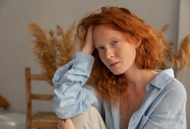
Visuals can make or break your promo campaign. Today's audience has a sophisticated eye, so it's better to avoid using unnatural stock photos with fake poses and forced smiles. Everyone’s seen them a thousand times! Instead, search for unique images taken by professional photographers. Pay special attention to the license, though – only choose pictures with licenses that allow for commercial use.

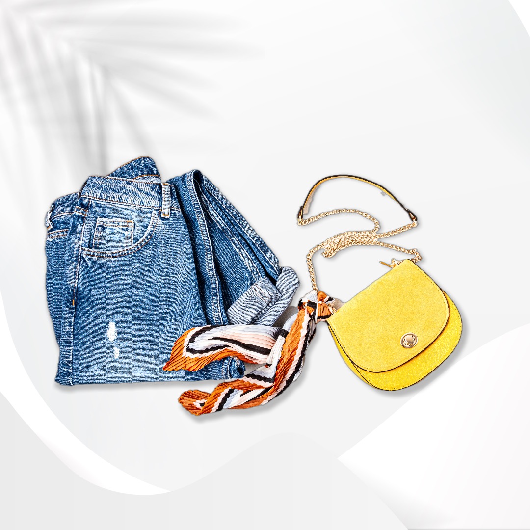
4. Make a banner design clean
As a rule of thumb, each banner ad should contain a product visual, a catchy slogan or offer, and a call to action. Sometimes designers will add a brand logo as well.
As you incorporate these elements, remember to keep the design balanced and clean so that there is enough air (blank space) in the picture. Avoid making the product image too big or adding too many decorative design elements to the background. Add text to your photo, but stick to the 3-4 line rule – the headline and body should take a maximum of 4 lines.
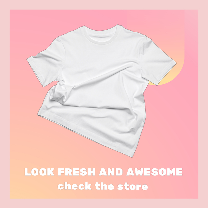
5. Keep it simple
Active social media users come across hundreds of posts and ads every single day. You only have a few seconds to hook them and explain what your promo and product are all about. Therefore, both visual and text content must be clear and straightforward.
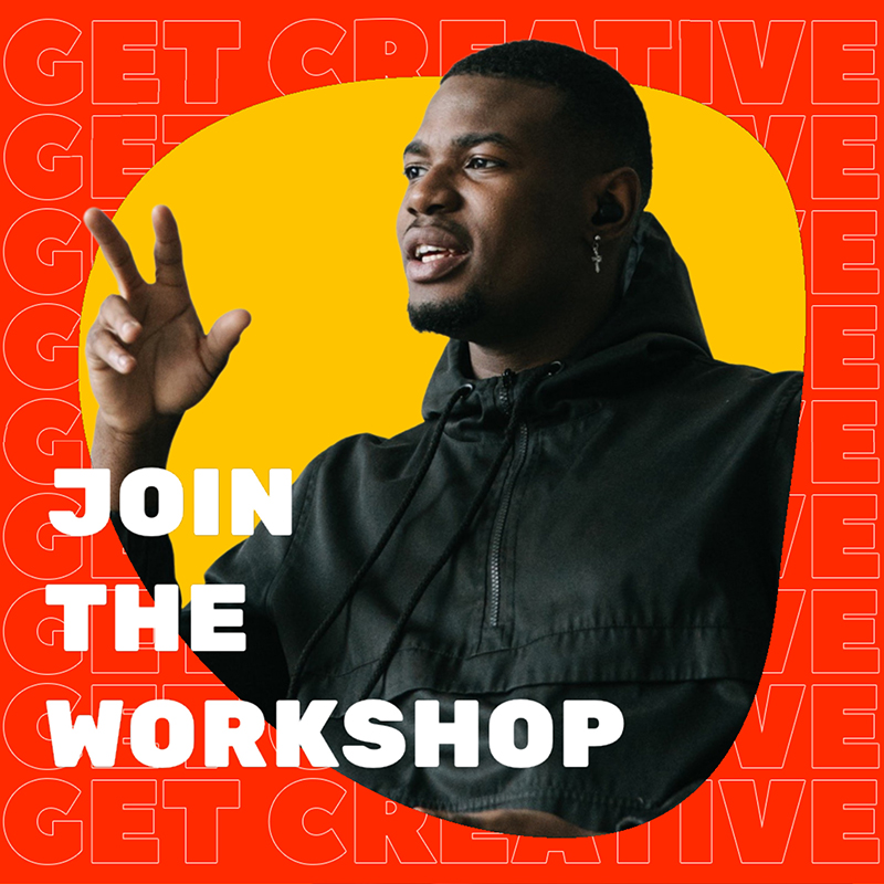

6. Opt for readable fonts and proper text size
This tip is closely related to the previous one: your copy should be instantly readable. Fancy cursive fonts add interest, but they’re not great for readability and understanding. The same applies to text size: do not use a very small or extremely oversized font. They both distract in unwanted ways.
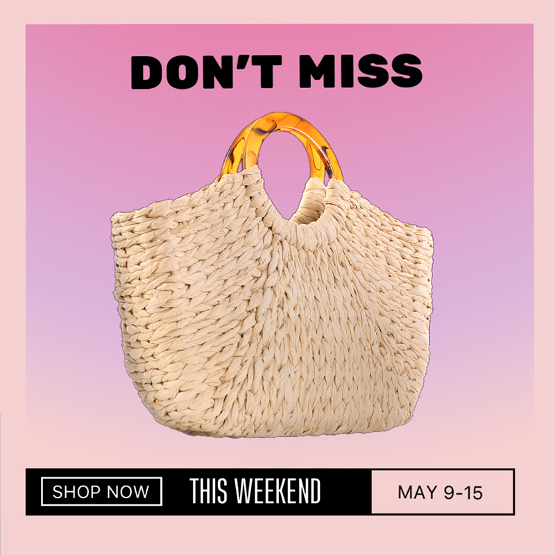
7. Use a call to action
Calls to action (CTAs) boost conversions! So, when you decide to make a banner, don't forget to use them on your promo visuals. These useful tips will help you create a cool CTA.
- Make it visible on your banner. For example, design your CTA as a button.
- Use concise, reliable, and catchy copy. Though you’ll want to say something catchy, prioritize making sure the CTA matches the experience they can expect after clicking the link. Avoid misleading users or making big promises you won't be able to keep, as that will detract from your conversion opportunities.
- Use personalization. Texts like “Get my gift,” or “Create my account” work better than “Get the gift,” or “Create the account.”

8. Embrace the latest design trends
To create a truly striking and attractive design, you need to keep up with the latest visual and social media trends. Incorporate them into your promo banners.

For inspiration, check out our posts on some cool Instagram trends and spring color and design ideas.
9. Stay true to your brand
Think this hack contradicts the previous one? Not quite. You can and should stay consistent with your brand identity, even while following trends. If you have a color or font associated with your brand or product, use it regardless of what’s popular right now. Your users will recognize your brand and feel more invested in your product or service.
10. Experiment and test
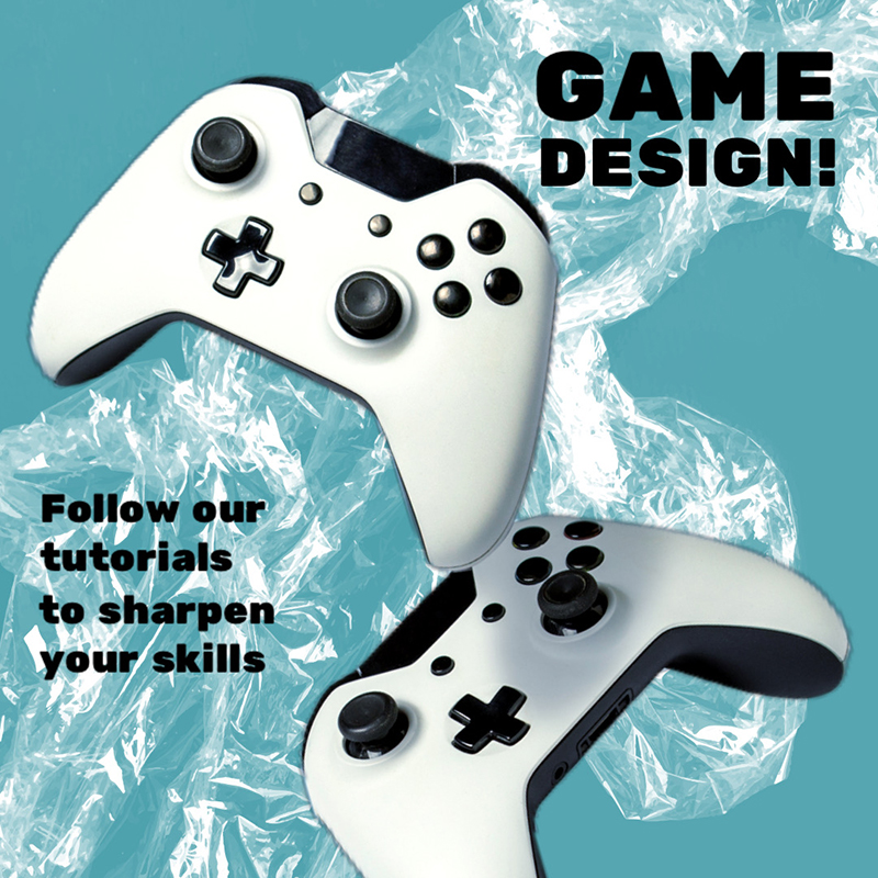
Predicting user behavior is challenging, for sure. The best way to figure out what visual style or slogan works best is to try a few different ad sets and see what performs better. Experimenting with your promo designs is a vital step, so don’t skip it.
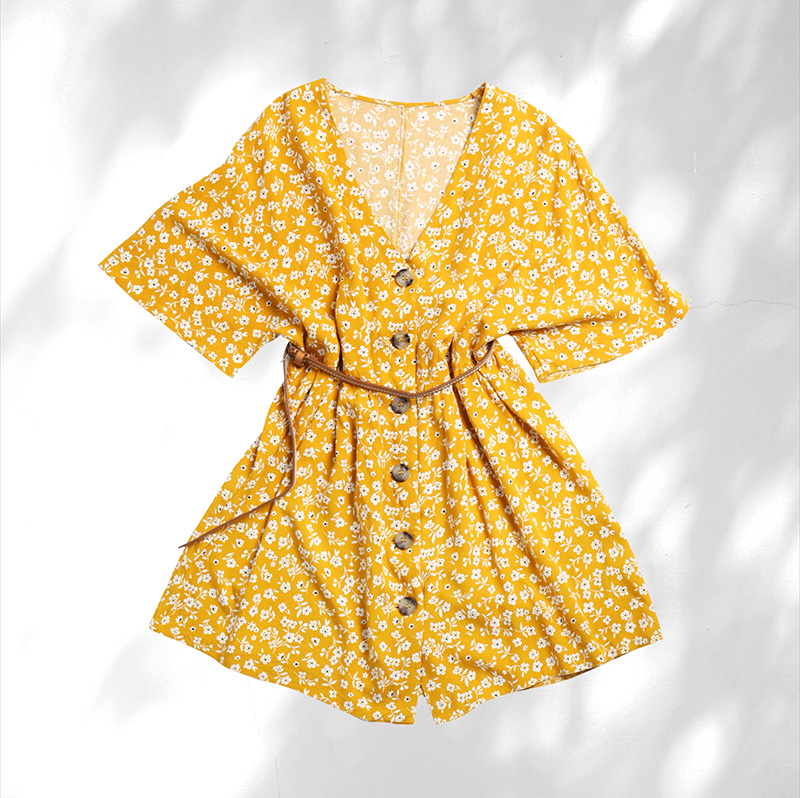
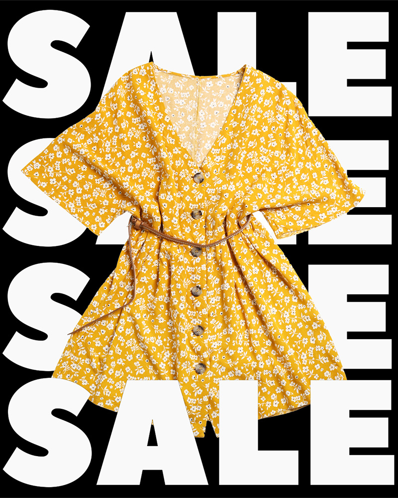
Now that you’ve learned 10 hacks for creating a successful ad banner design, it’s time to kick off your campaigns. Select a template from various ready-made ad banner options, or create your own banner from scratch. We can’t wait to see what eye-catching designs you can create!
Design a banner in seconds with Pixomatic AI & editing tools.

