 Pixomatic Team
We have all gone through a difficult decision of choosing the perfect thumbnail for Youtube. But why people put so much attention and effort into making their Youtube video thumbnails attractive? Before going deep into the articles of popular researchers about the theory of thumbnail, let's use our logic. So what’s happening? You just go on Youtube, scroll down to see what is new or recommended or simply search whatever is in your mind and BOOM! You’ve got a dozen of videos to choose from. The question is, how you will choose which video to watch? Yes, by Youtube video Thumbnail! History of Thumbnails Many popular bloggers, such as Smosh, Pewdipie, or Jacksfilms pay very detailed attention to their video covers, and of course, this art requires some work. If you go and search for successful YouTubers and look for their video thumbnails maybe 5 years ago, or 8 years ago, you will see a huge difference and tremendous improvement. Let us see some of them.
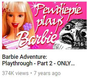
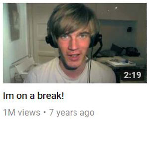
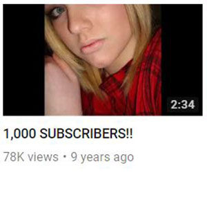
Looks awkward right? And this is why popular Youtubers started to put an effort in creating their video covers to attract YOU and to catch your attention.
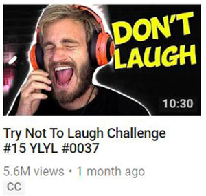
See how their thumbnails look like now, the difference is obvious, right?


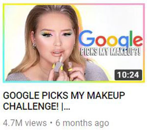
So what do you need to make a perfect Youtube thumbnail? You think of watching Photoshop tutorials or hire someone who will do the editing part for you for hundreds of dollars but NO, just click here to read a simple guide of how to make a good Youtube thumbnail for your video to attract your audience and collect more views. Meanwhile, here are some tips for you, young Youtubers! ADD TEXT TO YOUR THUMBNAIL Yes, folks, it makes sense to put a text on your image because it’s easier for people to read the text on the photo rather than the name of the video or a description, so put a couple of words on your thumbnail to make people immediately understand what is your video about or what emotions or feelings they might have while watching it. And when it comes to a text, you may say, I will put a text from the fonts I usually use. Well, not exactly, you shouldn't use Arial or Times New Roman or even your favorite Calibri that you use for writing documents in Word. You need sophisticated, cool, and new fonts that will grab the attention of your followers.
Here are some statistics about the most popular fonts Youtubers use for their covers.
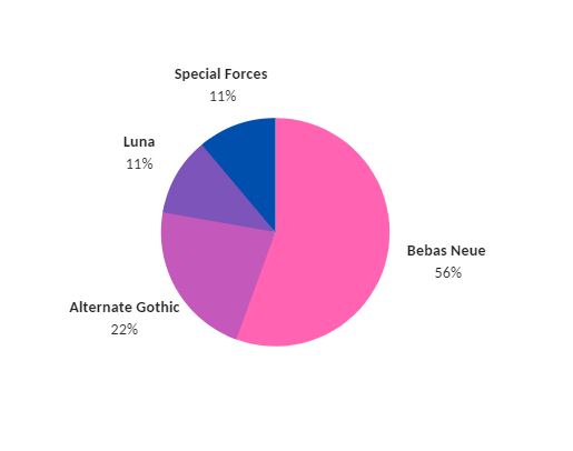
Regarding the colors and the overall appearance, you might use very bright and modern colors so that the user will notice you while scrolling suggested videos. Also, please don't forget to add some contrast to your thumbnail to make it even more noticeable! These are the most useful tips for making a perfect YouTube thumbnail.

