 Pixomatic Team
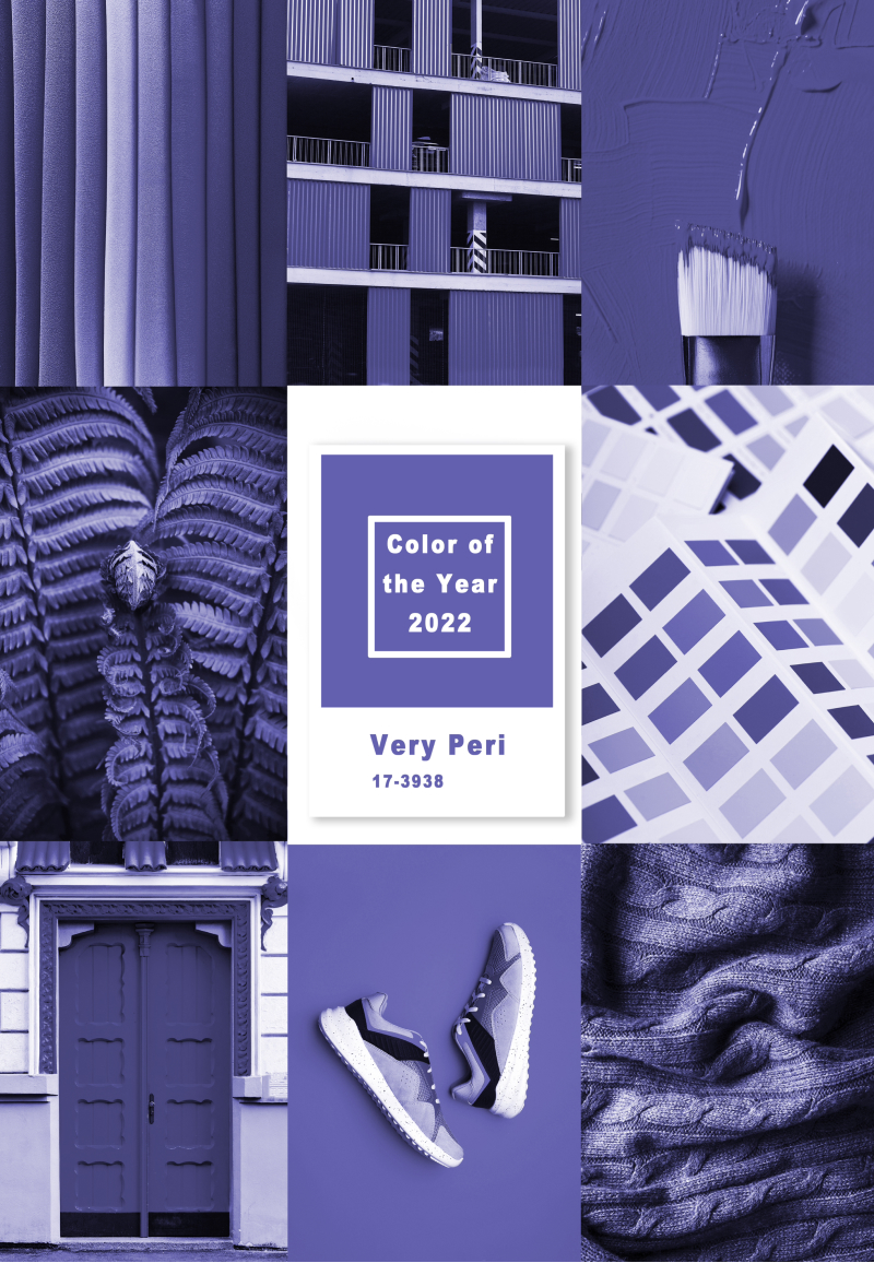
The Pantone Color Institute? It’s a global color trend-setter! Every year they choose the top color(s) that define the year’s vibe and inspire marketers, photographers, and digital creators worldwide. The main color of 2022 is a periwinkle shade of blue with a truly charming name – Very Peri.
Wanna know more about the color and how to add a splash of it to your social feeds and creative compositions? Then, you’re in the right place – dive right in.
Meet Very Peri – the biggest color of the year 2022
As the Pantone Color Institute defines the color, Very Peri is a dynamic periwinkle blue hue with a violet red undertone. With this combo, Pantone strived to mix the faithfulness and constancy of blue with the energy and excitement of red.
Such a beautiful description! Let’s dig a little deeper.
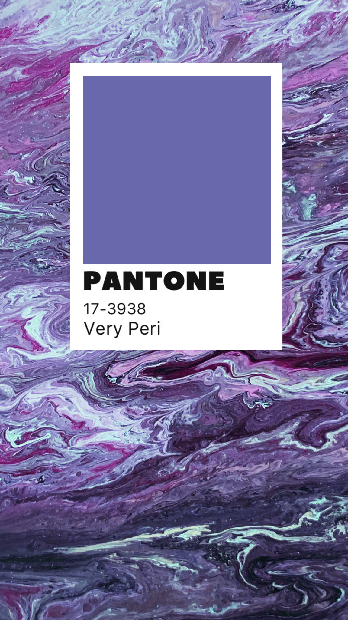
Very Peri symbolizes the times we live in. As the world lives through the pandemic and emerges from an intense period of isolation, the physical and digital have merged. The new trends like metaverses and artistic communities in the digital space are vivid examples of that.
The shade reflects this unique physical-digital blend and how color trends in the digital world are being shown in the physical world and vice versa.
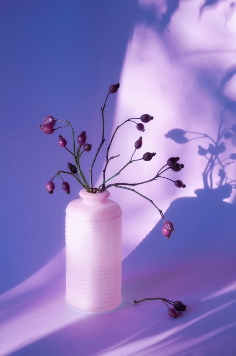
Using Very Peri
The beauty of this color is its versatility and сomplexity. It can create a completely different atmosphere – from a soothing, comforting, and calming mood to an upbeat, futuristic, and dynamic vibe.
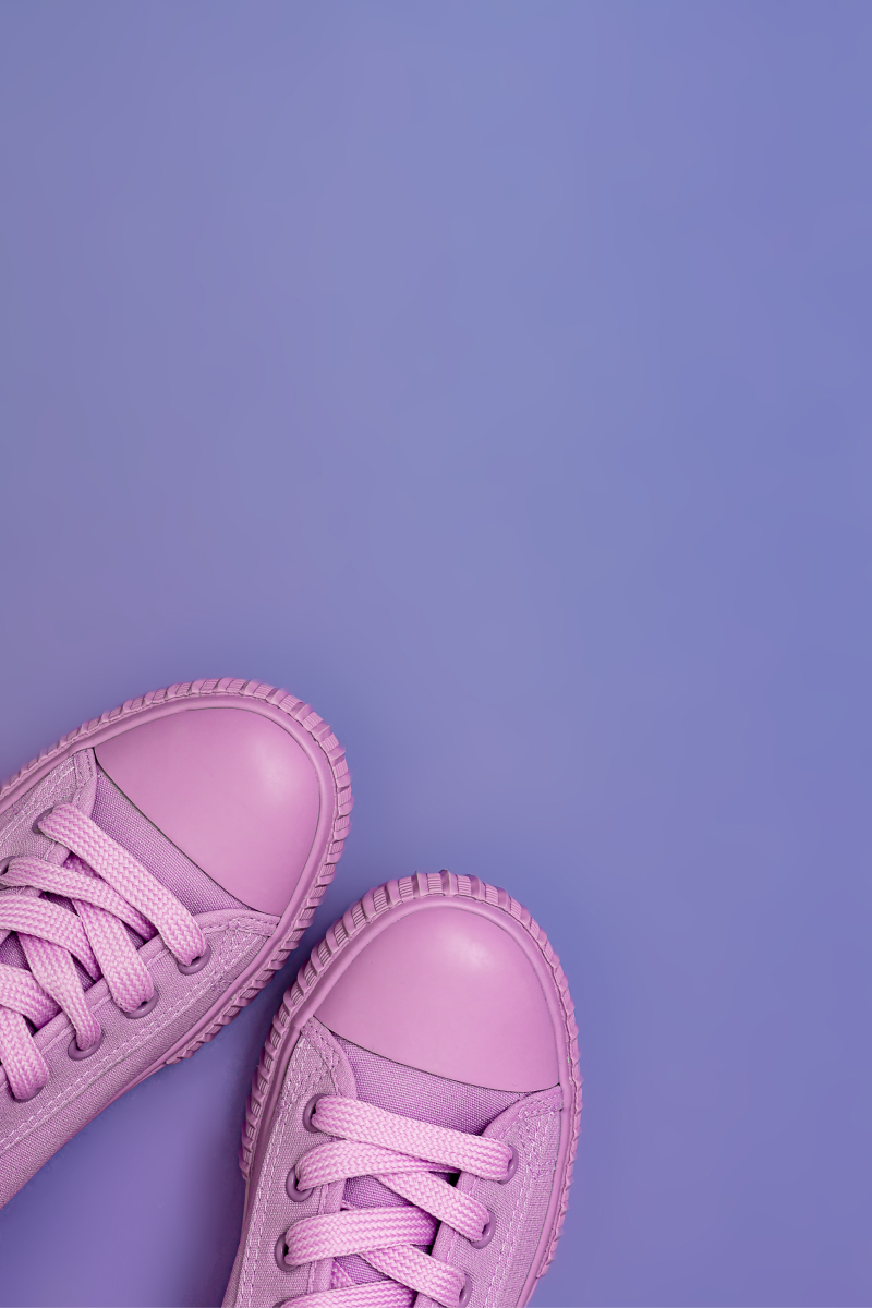
For instance, combine Very Peri with pastel and muted shades for a dreamy, soft, and tender photo.
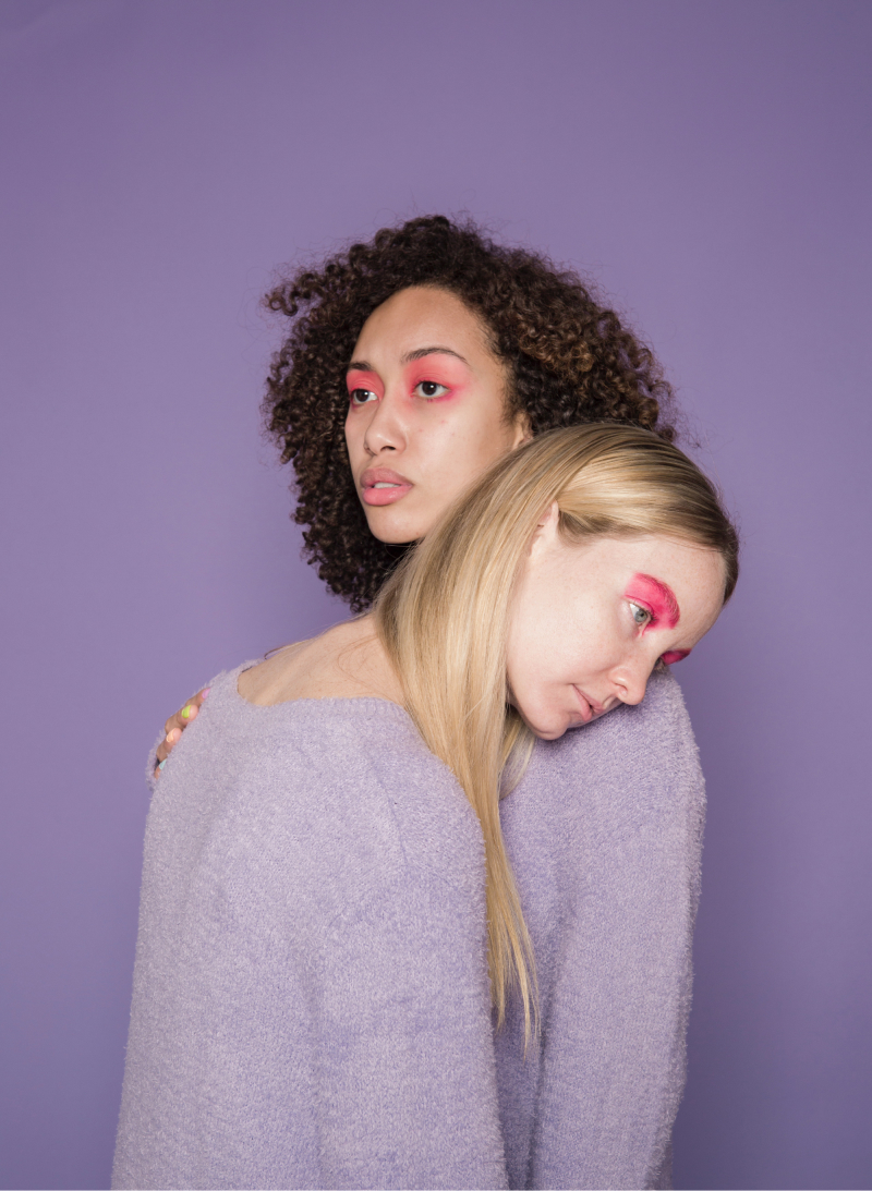
Or try pairing it with bold and vivid colors to create a contemporary neon craze. It works in so many ways!
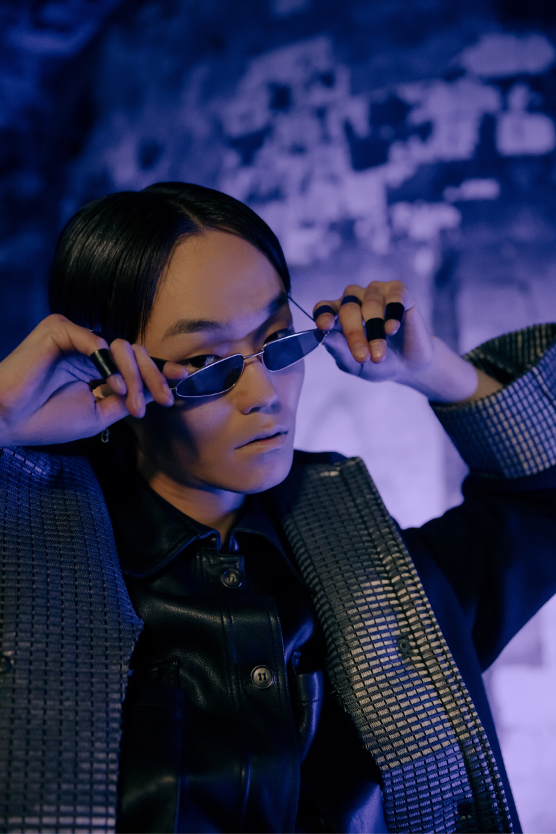
This shade can also be easily incorporated into your visuals as a vivid accent color. It will set just the right tone for your photo.

Finally, you can play with similar tones to Very Peri, and use their various blends to find a unique shade for your photograph.
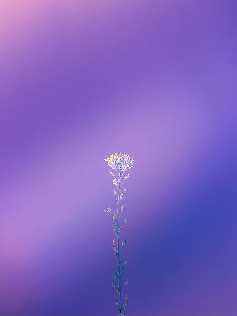
Very Peri splash with Pixomatic
If you are in search of ideas for your social media or marketing content, here's a compilation of Very Peri-inspired designs created with Pixomatic. These designs are all about mixing gorgeous blue, violet, and red tones – and are super quick to make.
Pick your favorite variants, and try with your photos.
Shape Cut Tool
Сreate your own story template by using Pixomatic tools – for example, Shape Cut to clip out objects of various shapes, and Text.
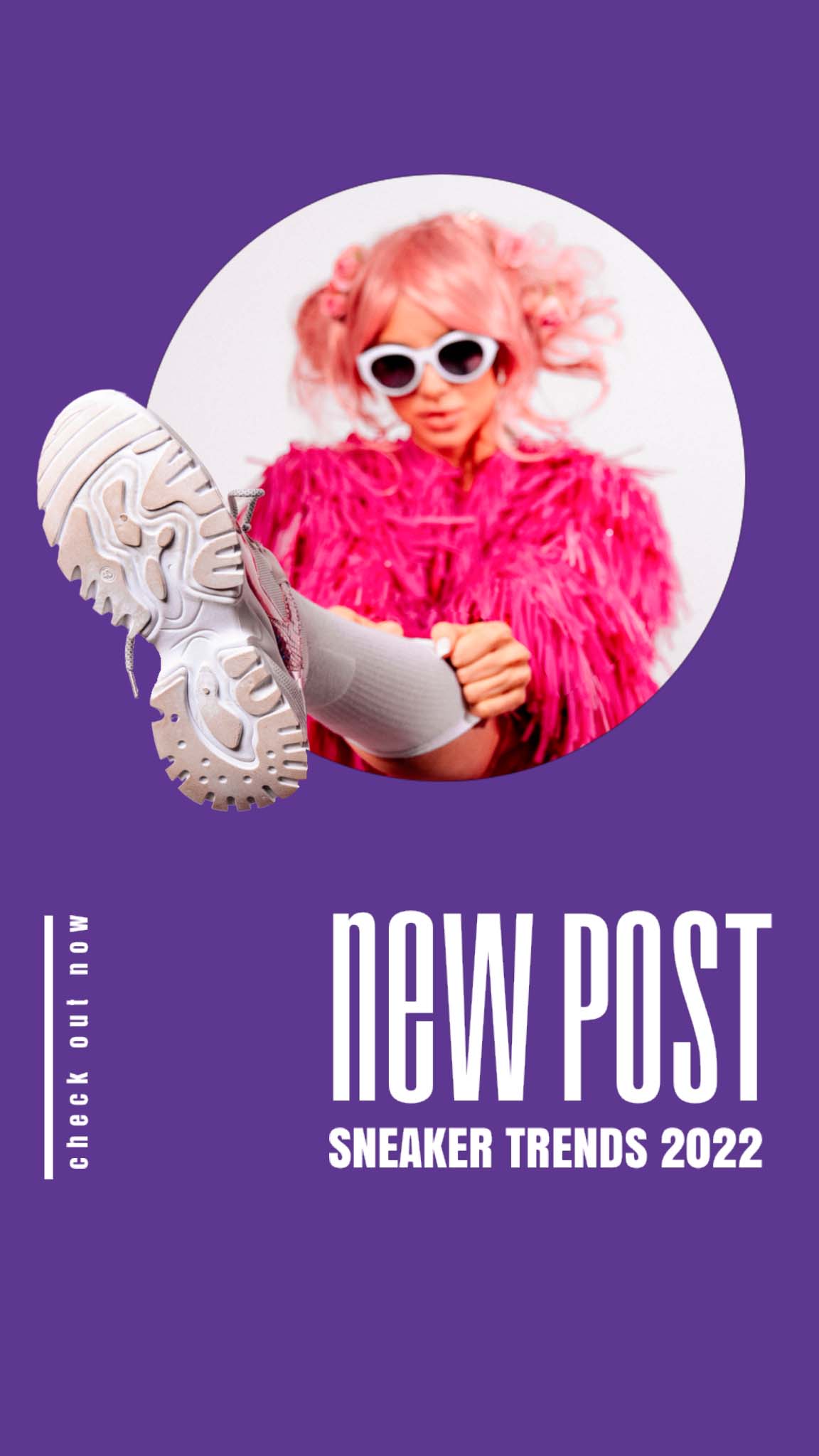
Artsy Template
Play with a variety of ready-to-use templates for your designs. Pick the one you like and simply add your image.
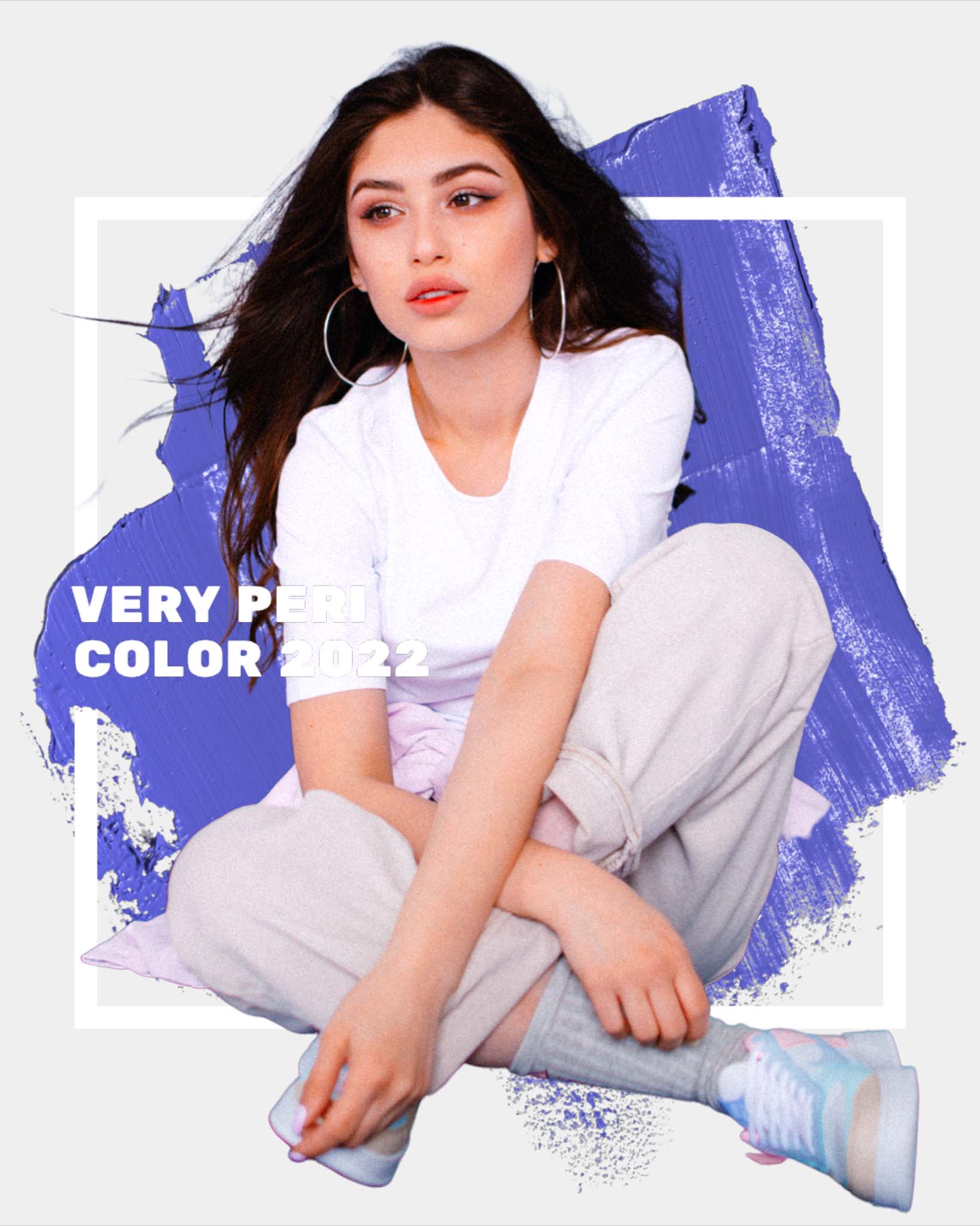
Stories Template
If you'd like to create an Instagram story, go to the Stories Templates section to explore violet-blue templates. There are many of them!
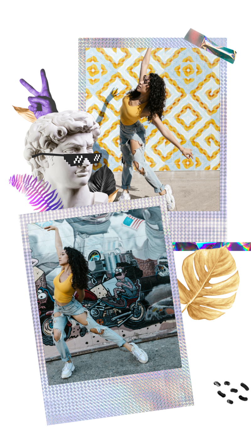
Effect and Subtle Filters
Gentle filters can also help you add the right vibe to your photo. Browse the Filters tab and choose the filter that works best for you.
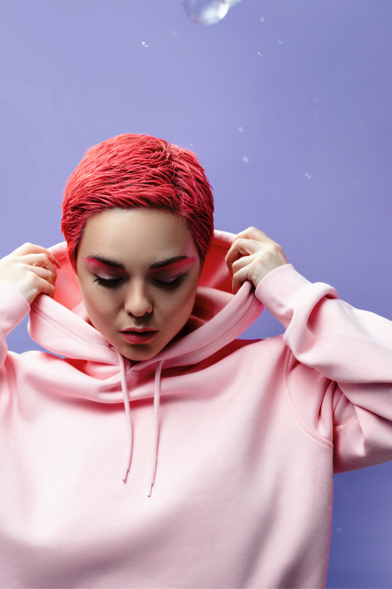
Bokeh Effect
Violet bokeh adds a magical and very romantic aesthetic to your photography. Click on the Effects tab, and go to the Bokeh collection.
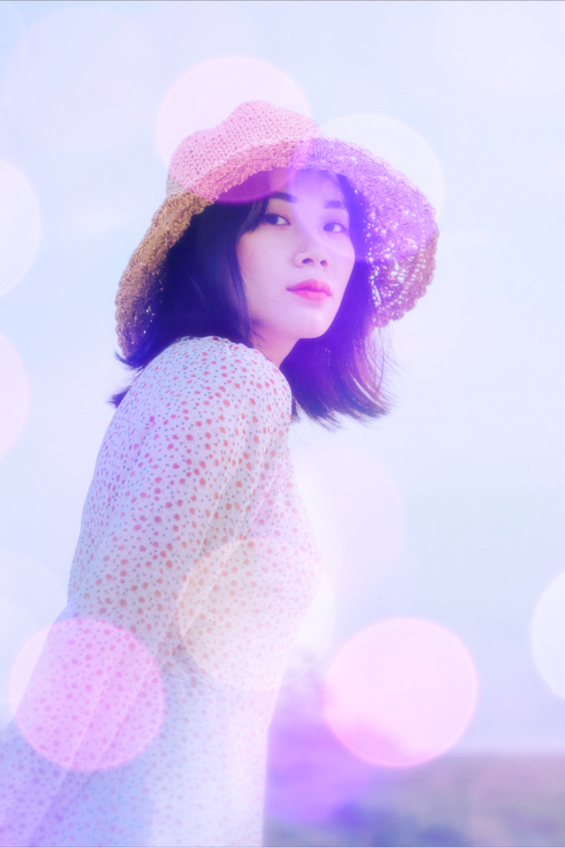
Colorize Effect
If you want to add a nice splash of color to your photo, try Colorize effect. It works in many different ways!

Neon Frame
Blue, pink and violet neon frames can make your designs look futuristic and trendy. Check them out in the Effects tab.
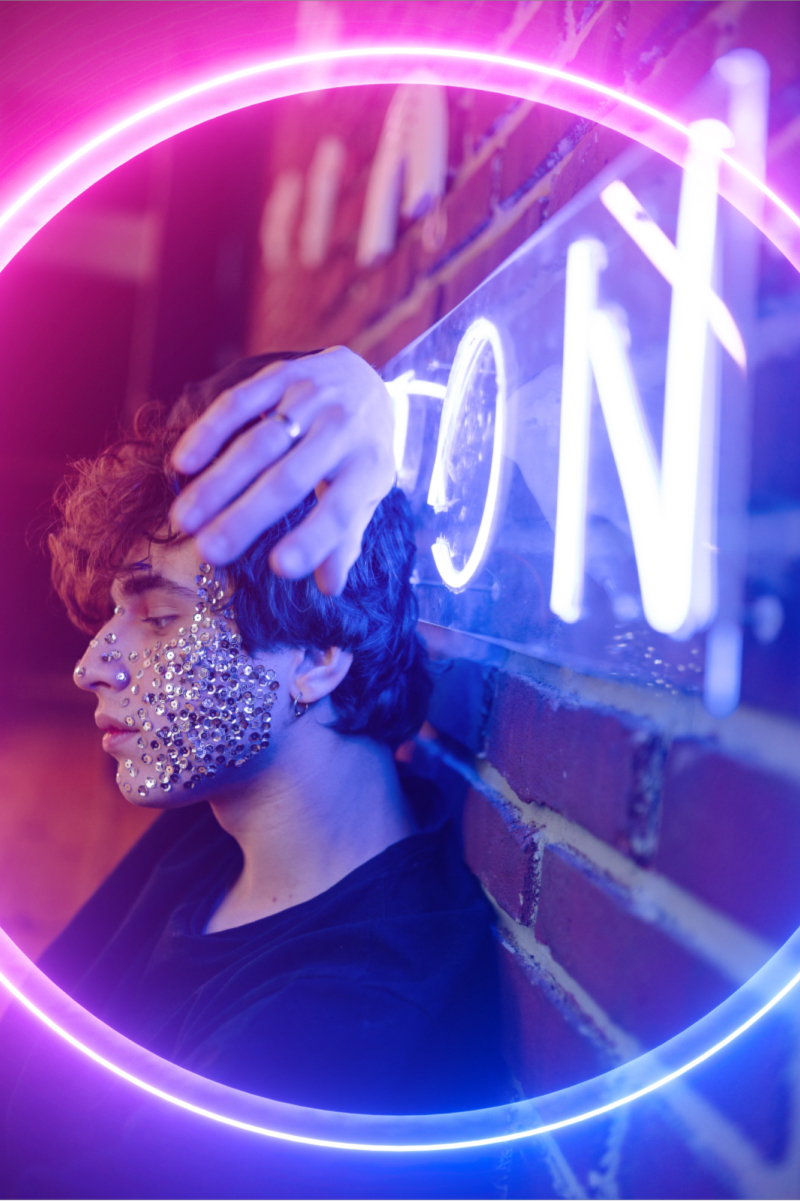
Monochrome Filter
Why not spice up your image by using the Monochrome filter? Look how awesome it is!
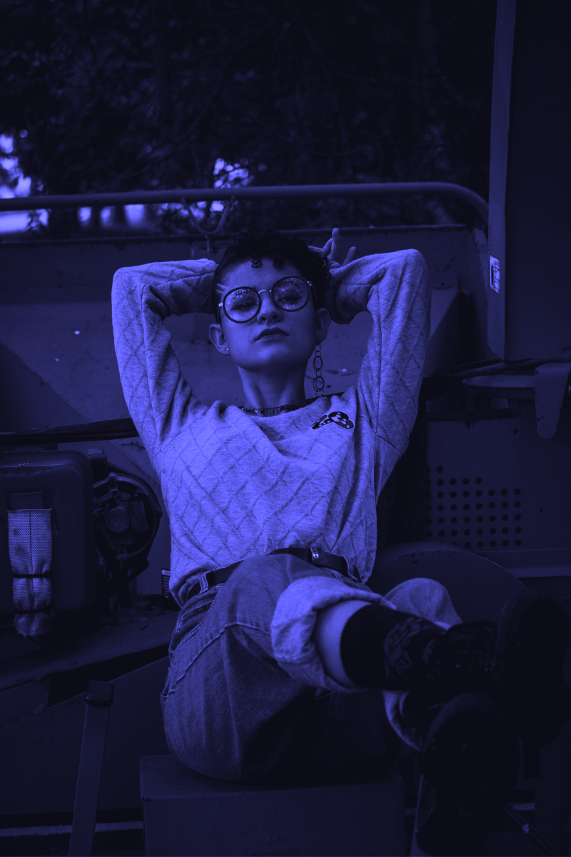
Very Peri is a bold, playful, magnificent, and futuristic color – and it’s really easy to adapt it to your photos. Use our editing ideas and generate your own creative content.

