 Pixomatic Team
You have definitely seen these magical levitation photos appear at least once on your feed before. While you can’t levitate in reality, these unique illusions are aesthetically appealing to look at. Making your desired objects or people float in the image can only be achieved with photo editing. You can decide to do a special photo shoot if you have a specific idea, or use images already at hand. While the idea sounds complex, we’ll show you how easy it is to create levitation photos with the Pixomatic desktop editor in only three steps.
Choosing Your Background
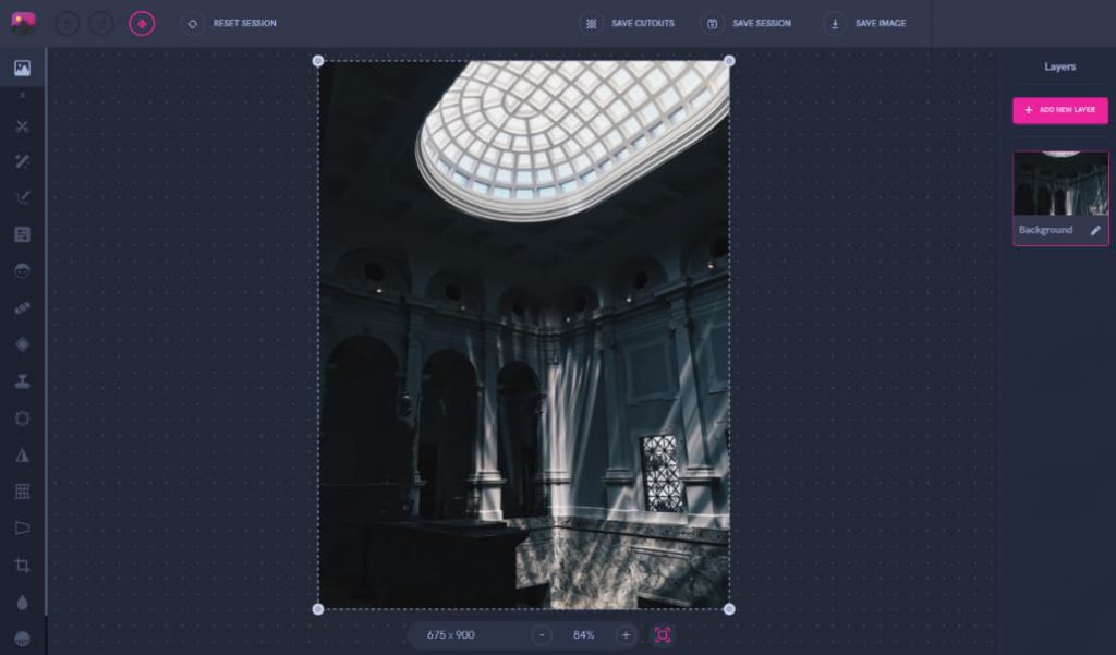
For levitation photos, your background image is just as important as the subjects or objects. The end result of your photo greatly depends on the background since it has to work in harmony with anything else you add. Your background also creates the entire mood of the photo, including lighting, colors, and shadows. This time, we decided to use a dark room of a museum as the base.
Edit Your Subject
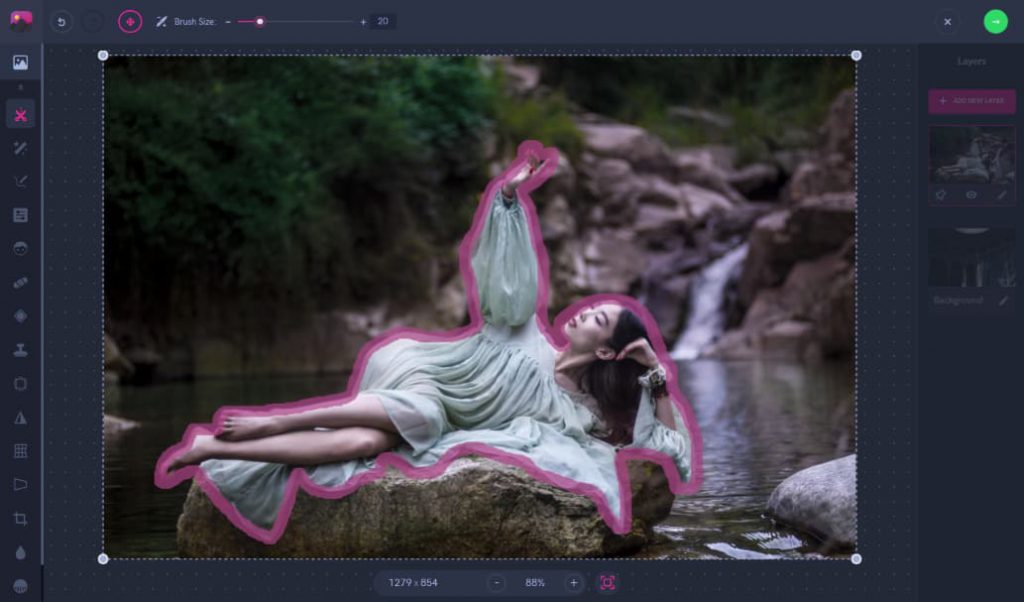
For this edit in particular, a woman lying down will be the main subject of the photo. In your own creations, feel free to experiment with adding several people in the shot. First, we’re going to use the Cut tool to separate her from the background of the waterfall scenery. Afterwards, she can be placed onto the empty museum background shown in the previous step.
Blending Everything Together
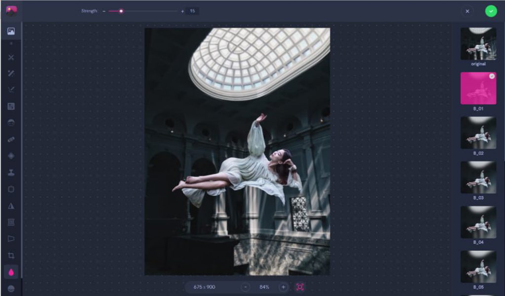
Now that the woman is placed exactly where we want her to be on the background, we can work on the finishing touches. Using the blur tool on low strength, we blurred out the background slightly. This is done to create more depth just like how a camera would do by focusing on certain parts of the image.
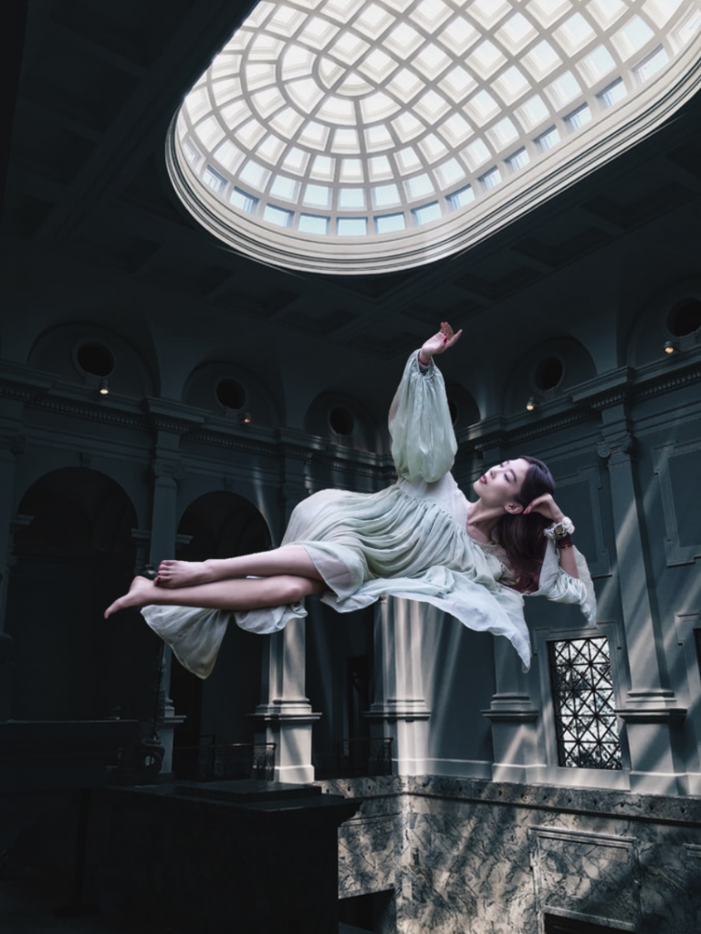
Now you’re done with your first successful levitation photo edit!
Instead of using ready-made photos, you can always do your own quick photo shoot. You only need to get two very similar photos to make it work. The best way is to use a tripod to take a still photo of the empty background. Then, adjust your model in the position you want her to appear in the final photo. Typically, a chair or stool is used to help balance her to the height you need. Once you have these two photos with the same lighting and scenery, you can move on to a quick editing process.
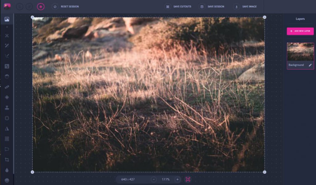
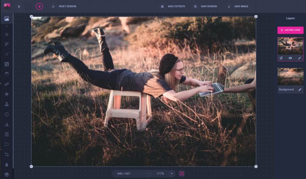
First, put the empty background image and then add the photo of the girl balanced on the chair on top.
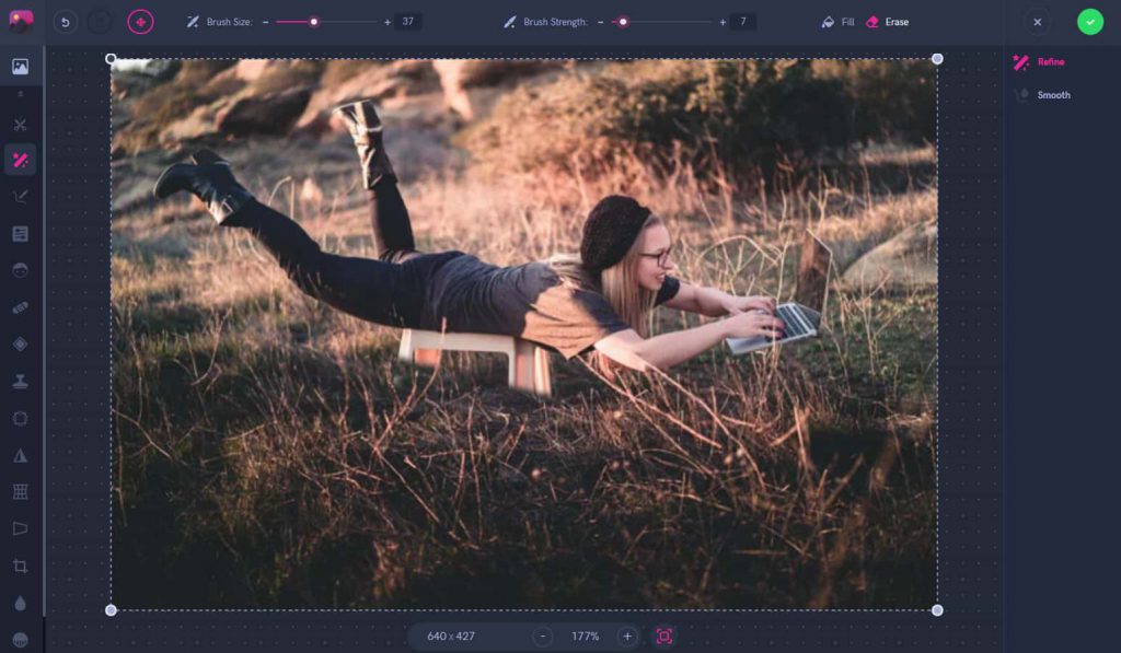
After adding both layers, we used the refine tool on the same editor to erase the chair and hands holding the laptop from the top layer.
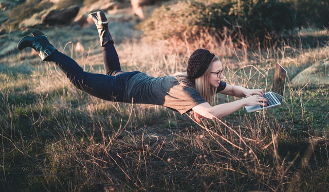
And that’s it! Within seconds, you will create the illusion that the girl is floating over the grass with her laptop.
As you create more levitated photo edits, there are a few important tips and tricks to keep in mind. The harmony between the levitated subject and the background is the most important thing to look out for. If they stand out too much then this will make the photo seem strange for anyone who looks at it.
What to Do
What NOT to Do
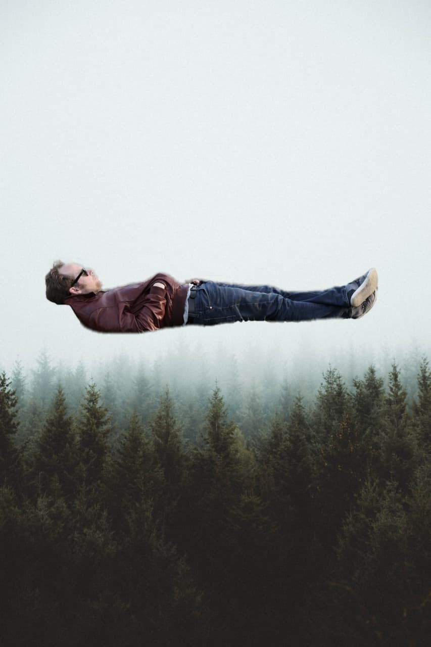
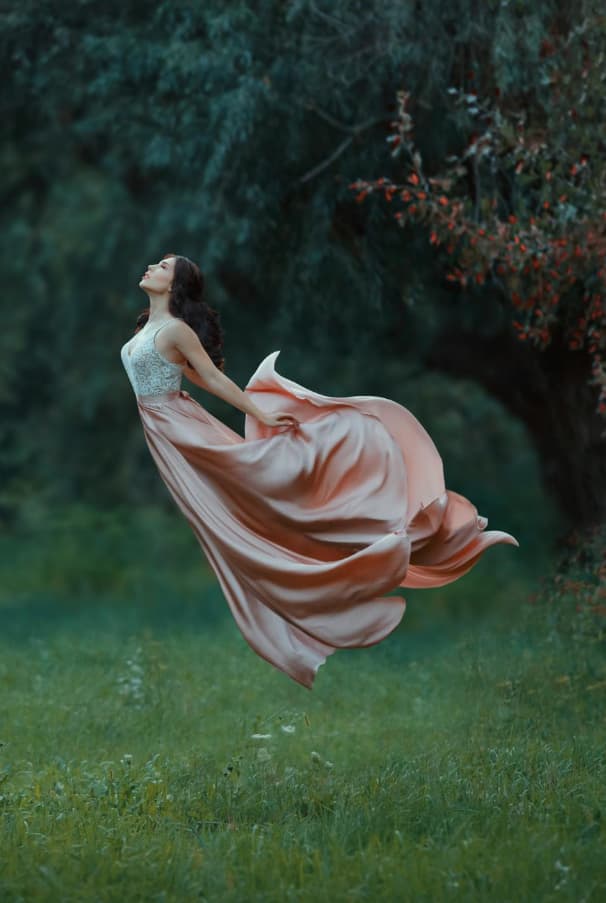
If a person is the main focus of your photo, avoid too many straight lines in their body position. As seen with the levitated man on the right, he looks too perfectly flat in the air compared to the curves of the woman’s dress.The more you have curves instead of harsh lines, then the image will flow better. This is so that they don’t end up looking like stickers on the photo, but instead they match with the entire atmosphere.
What to Do
What NOT to Do
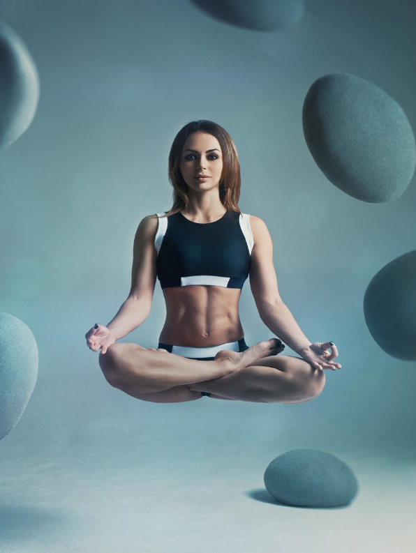
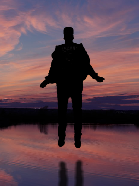
Shadows play a very important role in creating levitation photos. Whether you are lifting a man, woman, or toy into the air, they will cast a shadow. This is why you need to be careful if the ground is visible beneath the person you are levitating. In the case of the man on the left, his reflection is visible in the water below. To add this small, but important, detail we quickly used the Pixomatic editor’s shadow tool to place one. Without a shadow, the woman looks like she isn’t interacting with the surroundings of the photo compared to the man.
What to Do

What NOT to Do

Don’t limit yourself to just people, you can get creative with object levitation as well. Why not incorporate both? Mix a man or woman with books in one photo to end up with even cooler and unique results. The best tip to remember in this case is to make sure the colors and textures match together. While the blue books match with the man’s suit, the books and soccer ball seem like flat stickers that don’t have much depth. Choose all of your layers that come together and create a mood within the image.

