 Pixomatic Team
Banners are used in print and digital media to capture viewer attention and sell something, inform, or call to action. Ordinary banners use bland backgrounds and plain text. To make a unique design you need to think carefully about your banner’s purpose and the message you want to convey. A photo editor is the perfect tool for integrating text and image elements. It also enables you to experiment with different configurations and styles. So, what are some examples of creative banner designs?
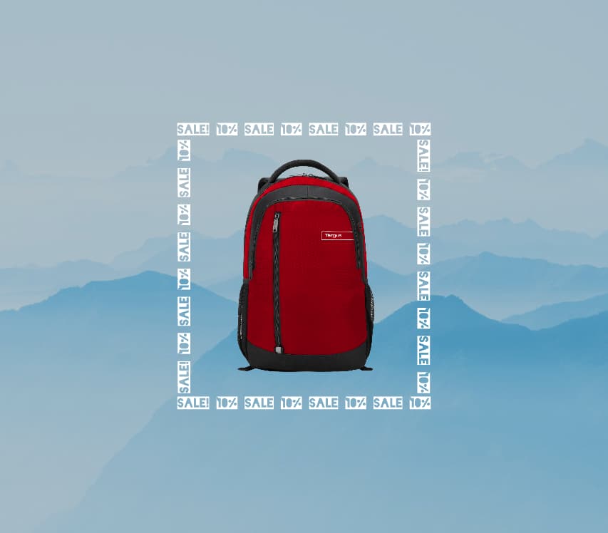
Frame
You may have seen the typical corner frames often used in social media banners and print posters alike. An interesting way to flip the scales and give the text a role is by using text as a way to separate information or enclose an image. This way, the photo can grab the viewer’s attention and make them stop scrolling down their feed, while the text can provide necessary explanations. A photo text editor will be your best friend in this situation, as you can easily choose a blocky font and rotate pieces of text to create a frame. The words will uptake a secondary role but can draw the viewer in. See for yourself!
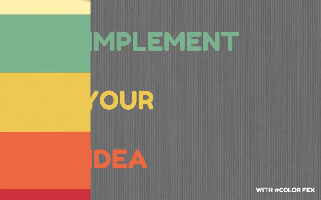
Color
If you deal with a background that has diagonal lines of color it may be strange to place your text at an angle, but don’t be afraid of trying something new! To accommodate your text to two different colors in the background it’s advisable to change the font color to a contrasting shade. Yet, to make a banner look less like a rainbow and more professional, you can simply use the background colors and switch them for contrast and legibility. That way the color scheme remains the same and you still get the message across.
This approach can make things confusing if your background has more than two colors. One creative solution graphic designers use is blending a portion of the words with the background. This is done by matching the exact shade and tone using the HEX or RGB value in the photo text editor.
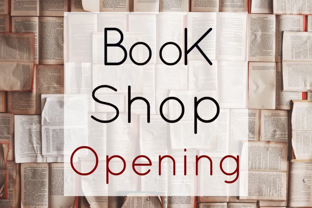
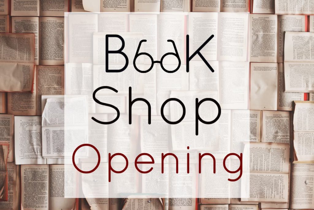
Integration
What could make a banner more fun and engaging to look at than by integrating photos and text? It is said that a photo can deliver a thousand words; just imagine the number of messages and associations you can send to the viewer with both elements combined! A photo text editor allows you to layer, adjust, and position image and text elements. This and an interesting concept are all the tools you need to create an expressive banner. If you do not want to repeat an idea in both photos and text then you can split the job 50-50. Find a shape that resembles the concept or object and embed it in a word. Your banner will be unique, attractive, and act as a charade.
Reshaping
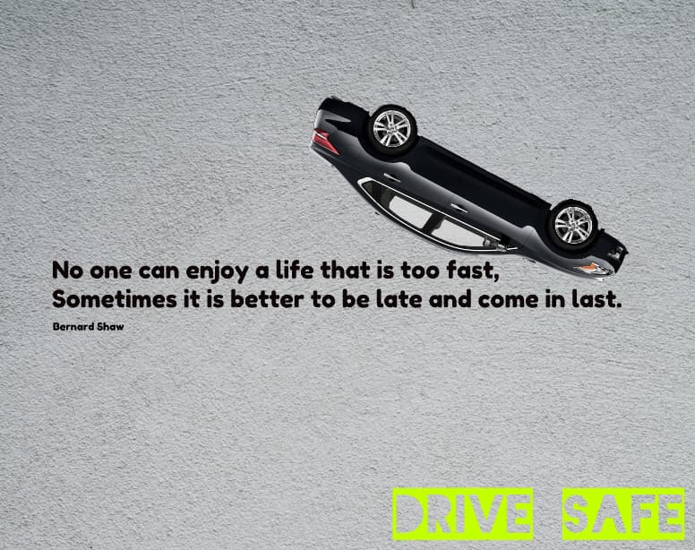
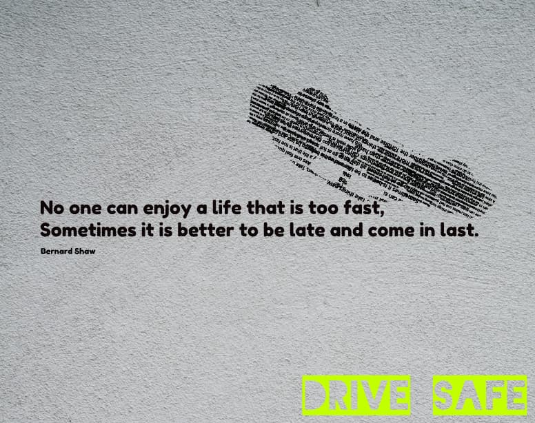
At times it can be hard to embed a photo in a piece of text when the concept is too complex. Instead of embedding images into text, you can reshape the text to recreate an image. A simple photo can deliver the message in a similar manner, but will it be as creative? The key is to have a photo to base your text shape on. You then arrange several fragments of text above it, which may or may not be relevant to the concept. And finally, erase redundant parts of the text with the Refine tool to recreate the object’s contour.
Graphic design skills are not a must when it comes to using a photo text editor. You can easily use these ideas and apply them to a concept of choice, be it for work or leisure. What makes a design creative is using existing styles and changing them to fit your message.


