Back
Back
 Pixomatic Team
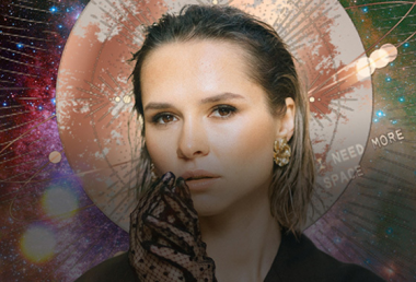
As we leap into February, you’re probably already looking to find some spring inspiration. Let’s say goodbye to winter and hello to a brighter and lighter season by looking at trending color schemes, fun photo edits, and what new features Pixomatic has in store this month for you!
As usual, we’ve put together 3 color palettes to consider when shooting or editing your photos this month. Whether you like light, dark, or colors in between, you’ll find a scheme that fits you best.
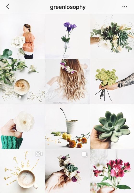
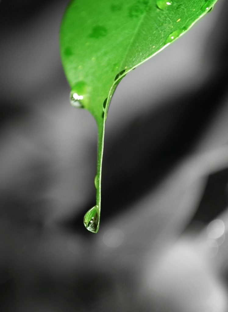
Let your photos be pretty in pastel with this color palette. It’s just the colors of the rainbow but in the softest shades you can find. This color scheme is a great way to add color to a gloomy feed after the winter season. The best part is that the colors aren’t too neon, they’re just bright enough to welcome Spring. Mint green, baby blue, and dusty rose are shades you should consider using more if you choose this palette.
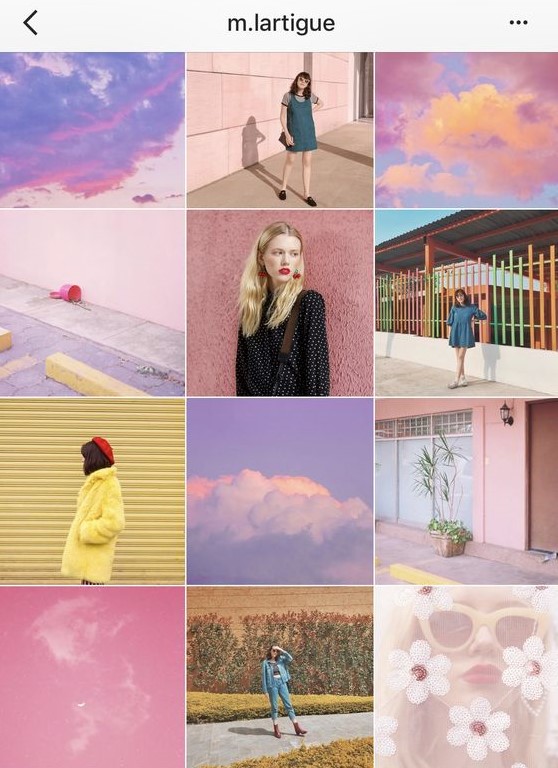
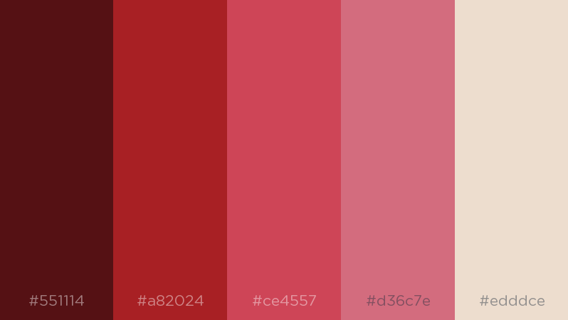
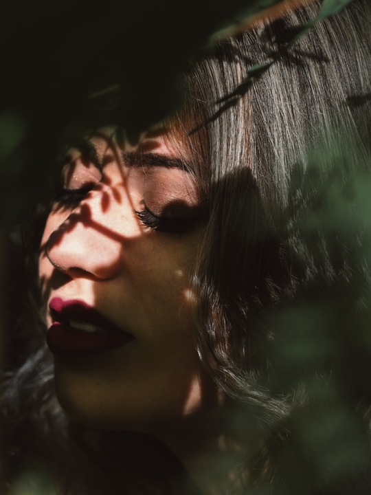
February is basically the month of love all across the world! With Valentine’s day around the corner, you might have a lot of romantic hues in your photos. This color palette includes deep reds, burgundy, and shades of pink. All of this together might be a little too red so include softer colors like beige or light pink for contrast.

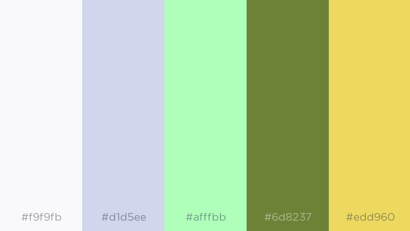
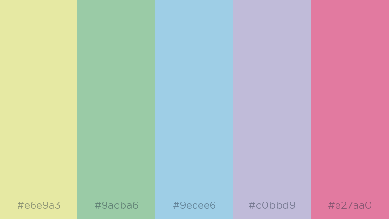
Want to keep it simple but unique at the same time? Then this color palette is a perfect pick. Play around with earthy tones that come with the end of winter and beginning of spring. You can still include colder shades like mint green and white, but with a touch of yellow or lavender to add color. In the end, you can put together a clean and simple, yet beautiful image feed.
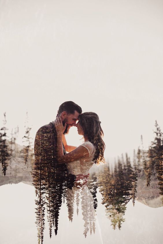
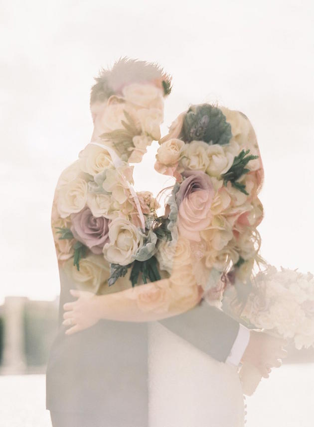
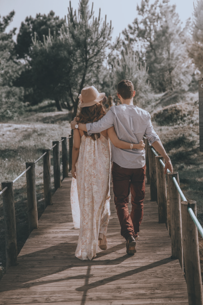
Want to share a romantic photo of you and your partner for Valentine’s Day? You can make it special by turning it into a mesmerizing double exposure image. Here’s a quick tutorial on how you can make yours.
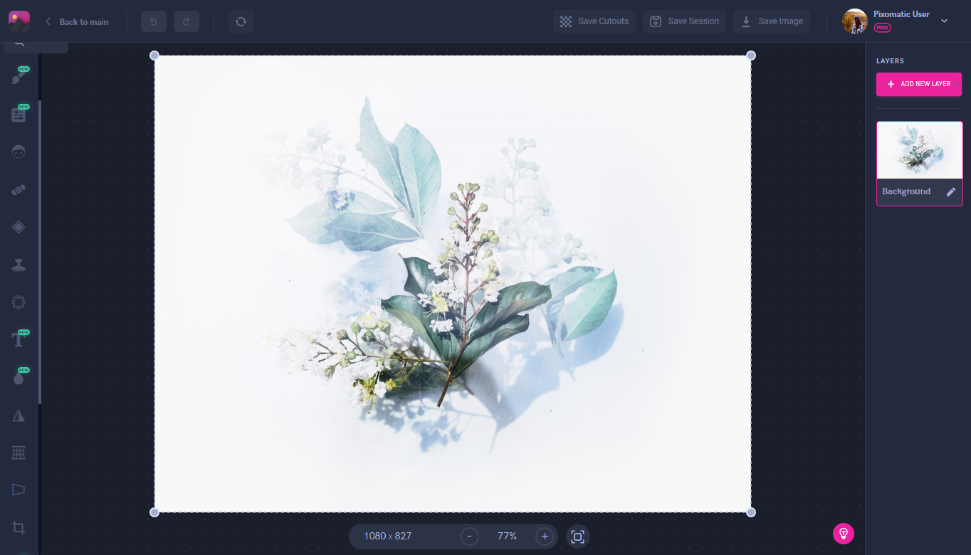
Start by choosing the right background photo for your double exposure creation. Floral patterns or forests are a common trend for this style since they are easier to work with.
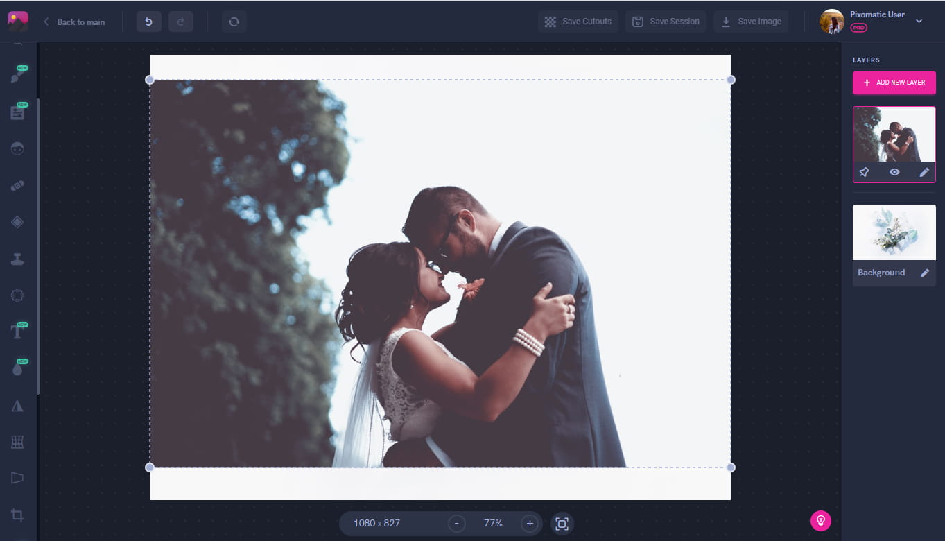
Now add the image of you and your partner on top. It’s easier to work with photos that have white or solid colored backgrounds for both of your layers. This will give you a harmonious merging of the layers.
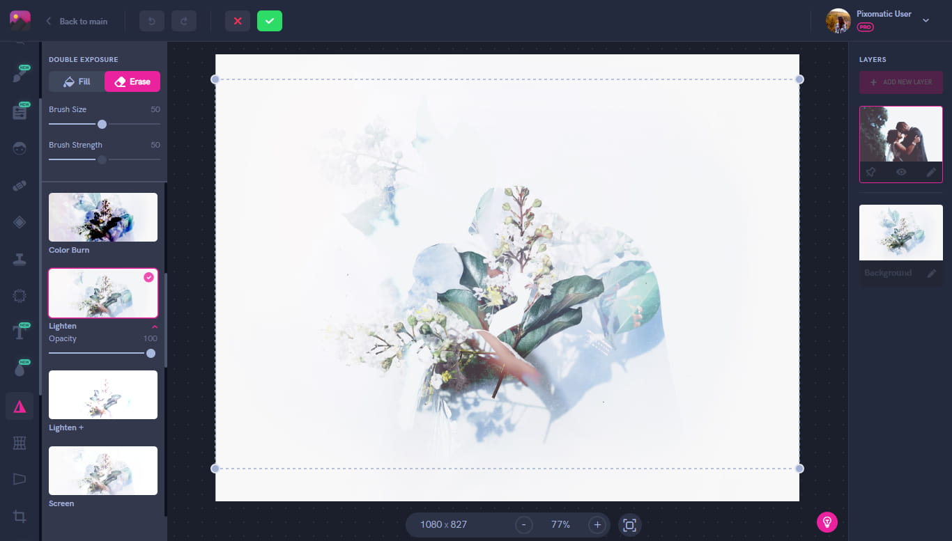
Using the Double Exposure tool, select the Lighten effect. You can test out the other effects to find one that works best if this one doesn’t suit your photo.
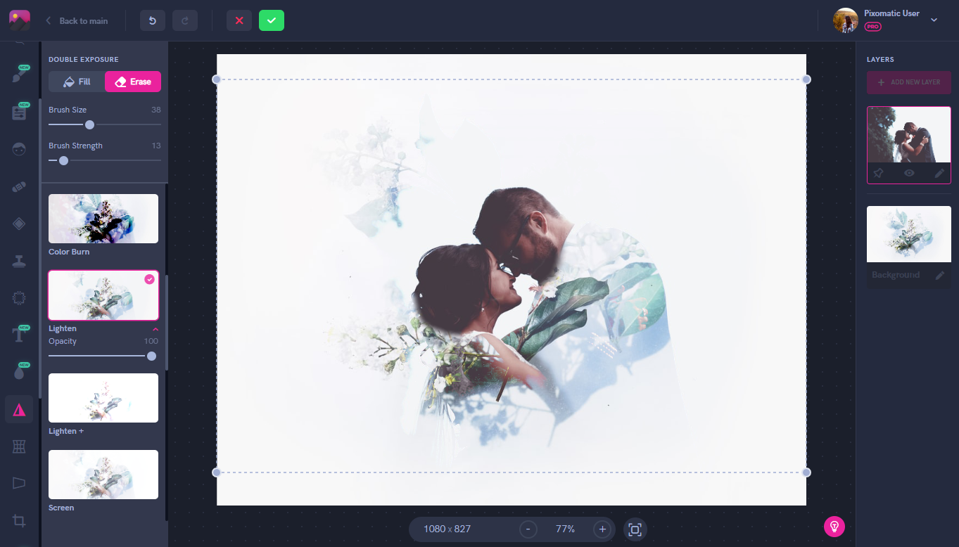
Using the Refine tool, erase sections of the image where the background covers the faces. You can adjust this step to your preference by erasing more or less to match the style you are going for.

As a result, you have a beautiful double exposure photo edit to share with your friends and family.
This month, Pixomatic has launched a new feature on the desktop editor: HSLS (hue, saturation, and lightness). You can find it under the Adjust tool. So what can you do with it exactly? By using the HSLS feature, you select a color in your image from the bar on the left by picking either red, orange, yellow, green, blue, or purple. Now, you have the power to adjust only this particular color in your image. Let’s say you only want to make the sky in your photo stand out, you would select blue and then turn up the saturation. You get a brighter sky while the rest of the colors in your photo remain untouched.
Now you no longer have to brighten or saturate your entire image just to color correct some parts of it. You can even take it to the next level and get creative with it. Desaturate all parts of the image and leave one element in color to get a beautiful isolated photo edit.
If it’s been a long and cold winter for you, then you’ve surely missed the warming rays of sun. But this doesn’t mean you can’t recreate that same effect for your photos.The perfect way to achieve this is by using the E6 effect filter on Pixomatic’s desktop editor to get that warm glow.
Sometimes your photos need just a pinch of color to make them complete, and the E4 filter is a perfect way to do this. Just a light pink undertone to your photos will make them look softer and more pastel. It's a great way to add some color without going too bright.

You don't have to let go of winter shades just yet. A dreamy, faded effect like E10 keeps the colors of the image neutral. It's not too saturated or desaturated, just enough to emphasize the colors only a little bit.
Now go and try these out on your own! We’ll see you next month for more trends.